Thursday 31 January 2013

Research and Planning

Research and Planning for Print

This is an example of an existing magazine front cover.
This is a simple contents page which has used one big image which is centred and edited. Again, the writer has stuck to three main colours being white,grey and black making them more dark colours which all contrast.
The heading is split up on different lines such as 'CO' 'NTEN' 'TS' making it stand out more than the rest of the text as there is a dramtic change in font size. There is a difference between fonts are there is 3 minimum different texts used throughout the contents page, these are used for the heading of the page, the subheadings and the actual text about whats contained in each page. This page is simple using one image and small text with not much which is effective as most people prefer to read a bit of text and look at the images rather than read loads of text that waffles.


This is a magazine for a young audience such as girl teens, this is shown with the glittery pink title and the themes colours are pink red and purple which tend to target female readers. The writer also uses lines such as 'Is she stealing your crush?' and 'Who's the fittest Justin & Harry battle it out'. These can enagge female readers especially younger ones to read as they  have their 'celebrity' crushes. They use a number of shapes such as circles, squares and arrows to make the page more creative and interesting to appeal to the target audience. The language is very simple using words such as 'hottest; and 'spooky' so that its readable for the target audience.


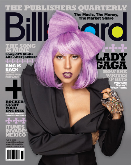
This is one fo the worst selling issues of the vogue magazine. The cover photo is very textual and unbalanced. There is the use of a pastel green and a shocking pink and baby pink, this looks more childlike considering its an adult magazine. The central picture of lady gaga is very revealing making it inappropriate for young readers contrasting with the colours and layout of the text. There is a lot of text on the front which could be offputting to the audience and everything is in block capitals which makes the sentences harder to read.It's not proper english to write in full block captials throughout every piece of text as it's hard for the reader to consontrate. The picture of Lady Ga Ga doesn't look appealing and looksa rather scary so again couldnt engage or appeal to te readers. Also, there is hardly any spare space meaning there is too much text which can quite frequently be seen as 'boring'.


Friday 25 January 2013

Pre-lim Analysis


I have used blue for the title ( being the name of the magazine 'Winstanley Fashion' and it is not a bold colour therefore it would be cheaper to print. I have used very standard colours such as blue grey and black which are not costly colour such as bold red and yellow to print as magazines usually stick to 3 colours maximum as it's their limit. I used a centred medium shot of a girl in a leather coat to be the centre of the magazine cover as its attractiv to a readers eye. I have used catch phrases such as ' Leather the New you' as it convinces a reader to read the magazine to catch up with the latest fashions and styles and is realy emphaisising the magazine.
I have placed the bar code is the bottom left hand side as its the least important feature of the cover as it is only used to scan when you but the magazine therefore readers wont take any notice of it and whith the way you hold a magazine you tend to cover your thumb over it anyway.
Also i have done the price in black overlapping the grey background so it therefore stands out more so the readers know its a cheap magazine with a lot in it.
I used photoshop to create the front cover as its easier to edit photos and overlap text making it look more professional and appealing to the target audeince which is students at Winstanley.

For the contents page i have contued the theme blue throughout the contents page aswell as the front cover. I have however faded it more so the background is more faint than the rest of the text which needs to be more readable over the background. Again i used photoshop to do this so i could insert pictures of exaqmples of winstanley students modeling some nice clothes that they may wear to college and their dail style. As this is just the prelim i havnt added proper text and i have simply just put the conents page, explaied where the letter from the editor would be and the list of what is contented inside this issue of the magazine.

Monday 21 January 2013

Research


RESEARCH DAY ONE.
 On day one i reserached and did a little analysis of some front covers for music magazine at different genre's. On this Kerrang magazine, a big image is used for the centre of the front magazine cover this is to give an example of a typical rock band singer, this being oli sykes and also to give an illustartion/example of types of bands contained in the magazine as everyone in this socienty is very stereotypical. The cover uses cartoons and also advertising  informing of a 15% off a rock band clothing and merchandise line again convincing the reader to but this issue to get the 15% off a product.
The magazine has used a variety iof different coulds especially primary colours such as yellow and red to make the cover stand out and seem more appealing to readers. The limited colour palet limited to the amount of colour they can use also known as the rule of 3 which makes it cheaper.There is an bold headline/title of the magazine to tell the readers who the magazine is for and to associate it with the music channel on TV called Kerrang.


This is the 'VIBE' magazine which consits of three main colours which are blue, white and black. This again in a simple less action packed front cover sticking to the rule of three, being the use of only three colours which makes it cheaper to print for the writer and less confusing and distracting for the reader. Also the photo has been edited so that the image is sharper as there in one simple picture centered in the middle of the front cover this makes it look more professional as time has been taken to get it toi a high standard. On most front covers there is a bar code,this one has filled a little more space as its in the bottom right hand corner and is small but not big. The title 'Vibe' is big and wide so you cant miss is therefore it stands out and is in a clear font. Also to advertise the magazine they have put the website underneith he bar code so it is visible and done it in black on a very light background so again it therefore stands out even though it is done in a smaller size but the same font.


RESEARCH DAY TWO.


I took some practice photos on different levels and angles for my media. I did a variety of different shots here being a few of them. I did this too see what the photos would turn out under different lightening and how the people i chose feel confidence wise for the magazine. I think that by each wearing a different colour and style of clothing it helps see what's best to suit the genre of my magazine and what i choose it to be. I believe that a little bit of practice can help to make the quality of my original print of my magazine better quality.